"Reflect, a brand new newspaper that combines the element of fashionable design influences, and traditional architectural newspaper values. Appealing to an audience of all ages, readers will be able to have an engaging experience that stimulates and feeds creative inspiration through design and communication"
- Matthew Maynard (Creator)
Recap

Brand
- Reflect - Mirrors a contemporary approach to a Newspaper design solution, a more 'fantasy' based word, much more interesting than the standard Times/Sun/Star/Telegraph approach.
- Logo to resemble a fresh modern look with a traditional inspired theme.
- Slogan echoes the brand identity, playing on words- representing Britain and the World.
Design Features
- Traditional columns/grids for newspaper/book enthusiasts
- Infographics, easier to help people understand complex information
- Music/Arts/Fashion sections that engage different audiences and can engage the younger generation respectively.
Aesthetics
- Letter spacing- introducing a modern approach to a serif based typeface design
- Minimalism/negative space- much more legible and interesting, less is more
- Each page uniquely grid designed, makes each page feel 'quality' and have a personality to engage readers
- Just as many pictures as paragraphs- newspapers can be visual and not just text informative, graphs, images, infographics.
- Colour coded pages so people can easily navigate/flick through pages and see what each section corresponds too.


Final Newspaper Design (Link)
The Magic..
http://syndrohme.com/matthewmaynard/
As the newspaper is 44 pages long.. It would be too difficult and cluttering to show every single design on the blog. The only real alternative to showing the design online was to create a functional and interactive 'flip book' version of the newspaper (Along side the printed one, as you already have). Upon following the link, users can experience a digital version of how the newspaper design affects the reading process.
As the newspaper is 44 pages long.. It would be too difficult and cluttering to show every single design on the blog. The only real alternative to showing the design online was to create a functional and interactive 'flip book' version of the newspaper (Along side the printed one, as you already have). Upon following the link, users can experience a digital version of how the newspaper design affects the reading process.
I'm very happy with how it turned out, a consistent theme runs throughout the whole of the newspaper that is extremely unique, analysing the design of both The Times (Broadsheet) and The Sun (Tabloid), I cannot see many similarities within my design, however I have taken the best of both newspapers and improved upon a singular design.
Please be aware, you will need Flash to view the newspaper, however it should be available to viewed on most Mobile devices (Along with interaction of swiping through pages, mobile version doesn't use flash) Here is a little snippet of what you can expect after the jump..
Browsers (Computer) expect...


Mobile Devices expect...


Front/Rear Design (Final)

Final Design for front/rear cover
I am very happy with the outcome of the design. The nameplate especially, it stands out very elegantly- it is taking up quite a huge chunk of the front cover, showing dominance and authority through design enforcing the brand. Although the nameplate is large, it doesn't take away from the other content on the front cover- there is easily plenty of information on the front cover that gives the reader an idea of what content will be in the newspaper.
The rear page, I wanted to design it to be similar to something of an Art piece.. Many newspapers tend to have a back page related to sport (As i already have a sport section, this was not needed) the backpage is a playground for the design. QR codes further the communication of design through interaction between the reader. The logo dominates the back page- easily identifiable and the date is easily located.

Front/Back Cover (Roughs)

-------------------------------
Rough idea for front and back cover/rear
- Rule of thirds division system in running - Nameplate/Image Headline/Content Body
- Emphasis on letter spacing with the nameplate
- QR functionality on the back page - SECRET!
- Simple and minimal back cover, QR, Logo, Date, Barcode.
Colour Coded Sections
News
Travel
Sport
Art
Fashion
Music
Promotes a much clearer design layout system so readers wont become confused by which section they are in of the newspaper (if they mis read the newspaper sections)
*ALL headlines will always be at the top left of each page- this structure runs consistently throughout the newspaper, it becomes clear and the communication of the page is much better than a confusing system.
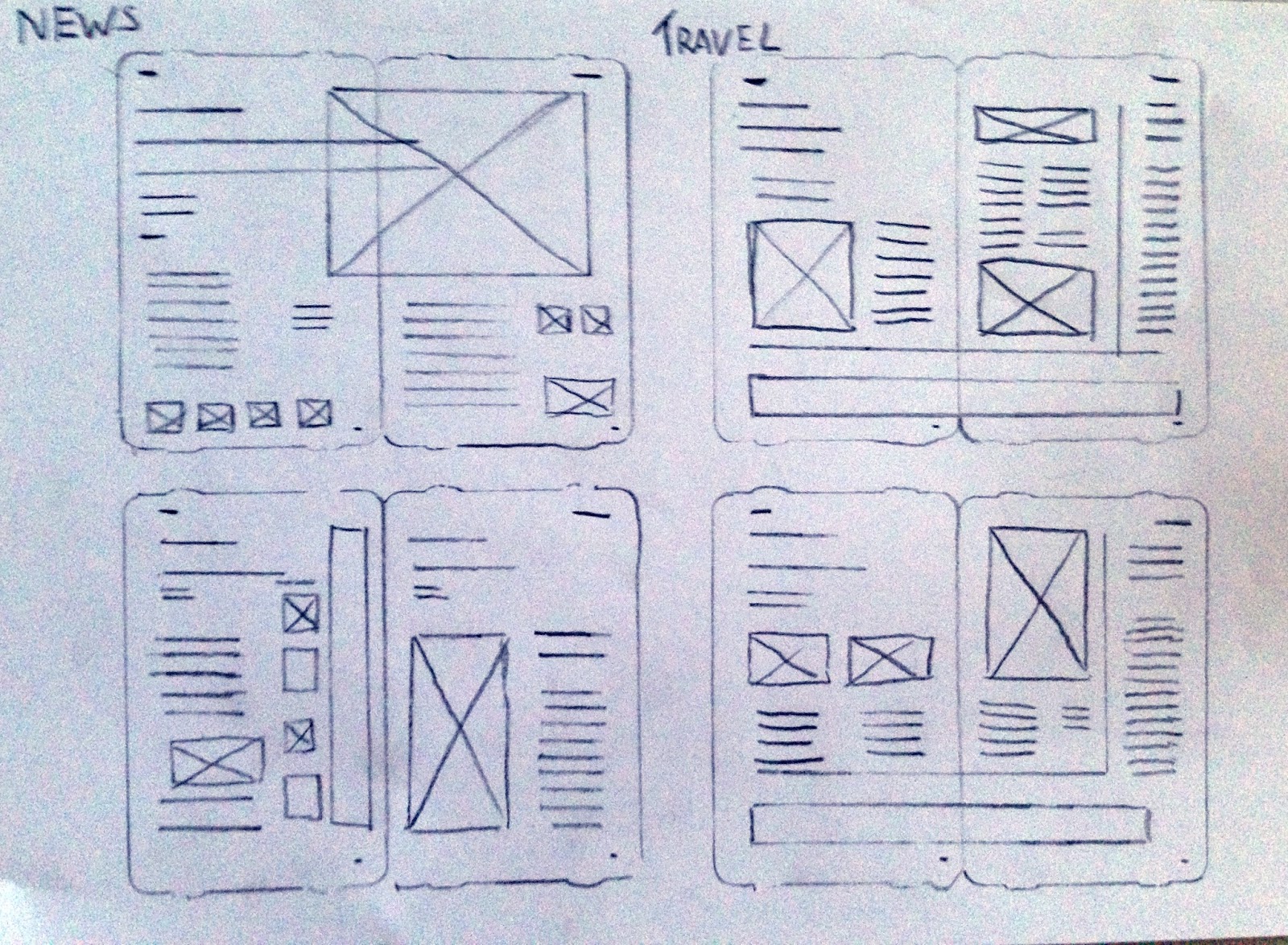
Page Layouts (Rough Grid & Sections)
Boxes/circles with an x - pictures
blank boxes - infographics/additional graphs
lines - text
-----------------------------
News/Travel Sections
News section (Red) is an obvious (Seeing as it's a Newspaper!) This section will be colour coded red, which is also the main colour that will be featured on the front and back cover/rear. This section will include many infographics and imagery. Pictures will spread across the spread if the article is a major story, whereby a double spread design is required (The use of a spread highlights the stories importance through design)
News section (Red) is an obvious (Seeing as it's a Newspaper!) This section will be colour coded red, which is also the main colour that will be featured on the front and back cover/rear. This section will include many infographics and imagery. Pictures will spread across the spread if the article is a major story, whereby a double spread design is required (The use of a spread highlights the stories importance through design)
Travel section (Blue) will feature the use a banner at the bottom of the page, it will be a continuous theme throughout all travel pages.. Not many double spreads will be needed here.

---------------------------
Sport/Art Sections
Sport (Yellow) will be very similar to the way the News section is structured design follows suit to many graphic and informative tables/infographics.
Art (Orange) is similar to Travel, whereby not many double spreads will be required, however this section will be heavily intensive with imagery and not so much with text, after all.. This section is about Art/design- pictures tell a million words.

---------------------------
Fashion/Music
Fashion (Pink) will almost be a combination of all previous sections of the newspaper, a similar banner will appear throughout whereby it offers competitions and advertisements. The use of block colour allows the audience to take interest at a deeper persuasive level
Music (Green) a unique section that will offer nearly all spreads to consist of one singular image with text overlayed on the image. A scoring system will be implemented here for reviews and releases.
Reflect Final Branding/Name Plate

Final Brand Analysis
I really feel that the brand has a strong potential aesthetic design. The Sans-Serif text looks traditional yet ever so modern, the dotted line that separates the name from the slogan strikingly matches the logo juxtaposition.
The reason behind the all-caps based logo and slogan is not just down to the dominance and powerful approach, it's also down to legibility when printing and blowing the logo up/shrinking. With it being caps, the text is much more easily identifiable.
Newspaper - Slogan Branding

----------------------------------------
Slogan's are definitely something 'Reflect' would need, nearly all newspapers tend to have slogans these days. It just seems to add a seemingly more personal level of interaction between the brand and the consumer.
The brand can be a brand, it is what it is- however in order to give a personality to a brand, a slogan can do just that, effectively and brilliantly.
Playing on the REFLECT idea.. Mirror/Light/Shadow are just some of the words that instantly crop up to me when thinking of a reflection.. Of course Mirror being the most instant thought.
As Reflect will be a newspaper promoting news and culture not only from the UK, but the rest of the world.. It only seems correct to have the slogan;
Mirroring Britain And The Rest Of The World
Reflect Brand - Full Design

- The logo that would resemble the 'Reflect' newspaper brand.
- World references
- Elegant and simple design, power of inspiration- stick in the consumers minds
- Unique - no similarities between any of the UK newspaper offerings
The Times Logo
- Proven to work, brand is strong and well known
- Emblem mirroring the lions of England, patriotic persuasive system
- Quite a lot going on, too difficult to draw if someone asked.. If it's usually too intricate to draw, the consumer will not always remember what the image of the logo looks like, not necessarily good advertising!

The Sun Logo
- Not really a fan- design is what i'd call TOO simple.
- Lacking in creativity - italic based sans serif text with a blank red background box
- Knocking aside.. It does seem to sell well as a brand, easily identifiable, easy remembered
Reflect Logo Brand (Roughs)

----------------------------------------
- Logo is just as important as the brand name 'Reflect'
- Looking at existing trends, these designs mirror some of the rough ideas that are in current 'fashion', especially the use of circular geometry based 'vintage' badges
- Although 'vintage' influence is great to promote the brands heritage, it's playing on the cliché values again.. I want to avoid this as much as possible, the box needs to be opened further
- Taking something simple such as the letter 'R' from Reflect may very well work.. But it's too basic and it's just a letter, whereby millions of logos will most likely have done this.. *EDIT - THEY HAVE......
FURTHER DEVELOPMENT
- Emblem type crest that usual newspaper brands seem to play on.. However updating it to create a more modern design
- A resembling symbol is proven to help subconsciously 'brand' it's way into the consumer's brain
- Reflect- something beautiful, like a flower, reflecting the beauty of our world..

- Quite 'royal' inspired feeling
- Not to traditional, not to modern - best of both worlds
- Perfectly symmetrical design - Reflect!

Reflect - Brand Typeface Banner

- Sefif72 (Custom Typface)
- 90pt
- 500 letter spacing
- Typeface 'reflects' a new contemporary modern design that takes inspiration from traditional British Design
- Flat lines text - The abrupt edges and points create a very classy and sophisticated text, without overdoing the visuals much like sans-serif fonts can produce
Reflect - Brand (Roughs)

-------------------------
Testing various typeface ideas with an Abstract/Serif/Sans Serif base.
I personally feel that the brand that i'm trying to portray, a modern contemporary newspaper.. Would be much better suited with a traditional and elegant Serif typeface, combined with with a unique gridding system- it's important to keep elements from both the Tabloid & Broadsheet background.. Only improve upon them.

R E F L E C T
- All capitals - provides dominant powerful approach
- Letter Spacing - Very wide spacing, negative space will help improve the powerful statement of the newspaper
- Thin Weighted Text - Keep that classy minimal feel, the brand is trying to be dominant, but discreet.
Newspaper Brand Concept

----------------
Newspaper brand concept generation
- Contemporary newspaper/fresh/unique
- Modern- stepping away from traditional values
- A name that brings a spark and personality to the newspaper, not a cliché usual newspaper name
- Identifying a unique brand
Itelligence
Life
Spark
REFLECT
REFLECT - REFLECTION OF THE WORLD TODAY, REFLECTING YOU AND I.
Newspaper Design Tips
If design had nothing to do with beauty, we wouldn't bother with it in the first place. Sometimes aesthetics take centre stage.
---------------------------
Expensive looking items sell.We often buy a brand because of it's name. I want to incorporate this persuasion within my design.
Design to inform, design to communicate, not just decorate. Very busy pages can be tiring and can dazzle rather than tell the reader anything.
---------------------------
Use of infographics and imagery will help me communicate my data much more than just that of text would.. It's important the design doesn't become too cluttered, otherwise my communication will be non-effective and this could potentially put off readership
Design to navigate. Design needs to lead the reader to what is most important, aesthetics mould the reading experience.
---------------------------
Good effective design will already guide the reader's eye from the grid column system, page to page, no confusion will be caused.
Design for balance. People love to see things fit like a jigsaw, text and images should follow symmetry.
---------------------------
I need to make sure I don't dominate the page with to much of the same visual elements, a combination between text and imagery will be the most effective design layout system.
Drawing the reader in is an art. Invite and immerse them into an experience in which the words and images create to tell one powerful story
---------------------------
I must create an atmosphere that combines visuals of text and image to produce emotion. Breathing life into each newspaper page will allow the audience to feel more in key sync with the design.
---------------------------
Expensive looking items sell.We often buy a brand because of it's name. I want to incorporate this persuasion within my design.
Design to inform, design to communicate, not just decorate. Very busy pages can be tiring and can dazzle rather than tell the reader anything.
---------------------------
Use of infographics and imagery will help me communicate my data much more than just that of text would.. It's important the design doesn't become too cluttered, otherwise my communication will be non-effective and this could potentially put off readership
Design to navigate. Design needs to lead the reader to what is most important, aesthetics mould the reading experience.
---------------------------
Good effective design will already guide the reader's eye from the grid column system, page to page, no confusion will be caused.
Design for balance. People love to see things fit like a jigsaw, text and images should follow symmetry.
---------------------------
I need to make sure I don't dominate the page with to much of the same visual elements, a combination between text and imagery will be the most effective design layout system.
Drawing the reader in is an art. Invite and immerse them into an experience in which the words and images create to tell one powerful story
---------------------------
I must create an atmosphere that combines visuals of text and image to produce emotion. Breathing life into each newspaper page will allow the audience to feel more in key sync with the design.
Good Quote Inspiration/Analysis
“What a shame to our age for making books void of lasting.”
Honoré de Balzac (1799-1850) – Illusions Perdues
This quote from Balzac
from his writings with Illusions Perdues
mirrors the modern view of how important design within newspapers can affect
its longevity appeal to consumers. A successful design shouldn’t necessarily
appeal to everybody’s taste; however, it highlights how design isn’t always
timeless. Persuading the audience to buy a newspaper, rather than read the same
article on a mobile device or another alternative newspaper must be achieved
through successful design creations.
Newspaper Print vs Digital News (Jacek Utko)
Newspapers could be in crisis?
Jacek Utko - Can Design Save The Newspaper?
(TED Talks Video)
-----------------------------------------
Really interesting video from Jacek Utko. It's a debate that's constantly spoke about whereby print is in the pits of depression, slowly losing sales circulation and popularity. Newspapers are in constant battle with digital offerings such as the smartphone and application equivalents of news.
Design from applications is bringing in a new audience (Especially younger individuals it's important that newspaper design can be adapted and fight off digital offerings, if not work with them!
I guess that's what my project really is about.. My dissertation is almost enough summarised here, my project will involve delving within to a new solution to a design approach to newspapers.
Inspiring Compositioners (Analysis)

Theo
Van Doesburg - Composition in Three
Panels, 1927
f all the arts that Van Doesburg touched perhaps his greatest influence lay in the area of architecture and design. Together with the architects JJ Oud and Gerrit Rietveld, it was he who took the flat, geometric painting of the De Stijl group and burst it out into the third dimension. Indeed he even tried to inform his work with a fourth dimension, although with what success is a matter of debate. Certainly he was fired with a thrilling spatial imagination. His axonometric projections of ideal houses, created in conjunction with the young architect Cornelis van Eesteren, are crucial in understanding this concept so it is a shame that they do not form part of this otherwise comprehensive exhibition. A plastic model of one of the proposed buildings (the "Maison Particulière") gives some idea but a 3-D model is not as striking as the original drawings. A model is too literal. In the drawings perspective is ambiguous; walls are no longer supporting structures but floating, intersecting planes of primary colour; rooms are not static boxes but conceptual spaces hovering in the air. The volumes of the buildings seem to explode from an inner core, as though erupting into the third dimension and straining for that elusive fourth.
In 1921, armed with such architectural visions (he had been talking of the fourth dimension since 1917), Van Doesburg set off for Weimar, apparently with the intention of mounting an assault on the portals of Walter Gropius's newly founded Bauhaus. Whether or not he expected to be taken on to the staff of the Bauhaus is not clear; what is certain is that his presence was a yeast in the ferment that swirled around the design school. Some, such as Gropius himself, were alienated by Van Doesburg's dogmatic and aggressive views; others, such as the young Mies van der Rohe, were inspired. In June he was publishing De Stijl from Weimar and the next year he began his own De Stijl architecture course, poaching students from the Bauhaus itself. This was a crucial time in the development of the Bauhaus, when it was in the process of moving from its individualistic arts and crafts origins to embrace the uniformity and austerity of style that was soon to be given the epithets "modernist" or "international"; the first architectural style for almost a thousand years not to imitate something else. Van Doesburg's contribution to this shift in emphasis was crucial. He preached geometry and the use of primary colour and the submersion of the individual in the collective, things that later became an integral part of the Bauhaus philosophy.
---------------------------------------------------
I particularly like Theo Van Doesburg's work, his influence with constructivism is very important to design, the grid system mirrored in his work above is very similar to Newspaper Grid Systems.

Max Burchartz - Internationale
Ausstellung Kunst der Werbung, Essen, 1931
Although Burchartz can be considered the pioneer of modern design and can be compared to older artists such as Peter Behrens and Anton Stankowski, he never received the same fame. Many of today's communication designs, such as the color control system, are based on the work of Max Burchartz.
In 1924 Burchartz moved to the Ruhr District where he set up the first modern advertising agency in Germany with Johannes Canis on November 1, 1924. He dedicated himself to the new typography and color design of the building. Artistic and economic success soon followed. The first customer of the agency was the Bochumer association. Burchartz developed a new layout style that blended typography, photography, and photo collages.
In April 1927, Burchartz finally received a degree in typography at the Folkwang Schule. Later that year he joined the architect Alfred Fischer, who built churches and the Hans Sachs house. Burchartz developed a color control system for the corridors of the house and thereby created the (presumed) first example of applied Signaletic in a public building. In other words, each floor is assigned one of the primary colors and labelled 'red floor, green floor, etc...'. After World War II they were painted over and forgotten and the style was not 'rediscovered' until the 90's.
---------------------------------------------------
Max Burchatz work, is most definitely a fine example of how columns work within grid systems in newspapers. His minimalistic style is really inspiring and the negative space that makes up nearly all of the works content above, something that is usually really hard to pull off if not done correctly.

László
Moholy-Nagy - Dynamic Of The Metropolis (Sketch For A Film), 1921/1922
Except for a very brief hiatus at the end of the 1920s, Moholy considered himself a painter, first and foremost. His short autobiography, Abstract of an Artist (1944), gives an account of how his art evolved. He wrote that at first his work was figurative because he found the contemporary art of his day chaotic. He didn't understand Cubism, Fauvism, or Futurism. He studied the drawings of artists like Rembrandt and van Gogh and became fascinated by the expressive power of lines alone without half-tones.
Then he began to study composition and, finally, the effects of color on composition. He made collages of juxtaposed colored paper strips and carried these configurations over into paintings of agricultural fields. By 1919, if not earlier, he was also experimenting with Dadaist compositions.
---------------------------------------------------
Lazlo has such a unique style, look at the way his work flow is operated.. His work above shows the way his page is completely split up via a grid, it's an unconventional grid and is something that experimentation and unique. This is exactly how i want to convey my newspaper design.
The Role Of Newspaper Grid Design

The grid or grid is the structure that defines the design of the publication, we must look ahead to build all levels of editing that must have a story (note major, minor, short, etc), graphics (tables, charts, figures , etc) and of course typing attributes (font, body, spacing). To design a structure that supports the daily issues we will create a system that covers all instances of information we need to tell the story and create the different elements of issue for which no purpose is other than to help understand the story. All this project thinking on the readers (and potential) combined with human skills and the environment and business strategies defined at project initiation.
Whatever the format of the day on which we will work (tabloid, Berliner or standard) concepts for the construction of the grid do not vary significantly, except for differences that may exist in the choice of columns in particular between the tabloid and berliner compared with the standard. While overall the trend is to use five in the first two and six or seven in the third, which should be a priority for its definition is to analyze how the readability of text in the column width of the central text of the news because this is the soul of the content. Studies on reading conditions tell us that the ideal is 7 to 10 words (50 to 70 characters) per line, although this is not usual in the newspapers. It is recommended when a project is started from scratch that the election marks (which should be clear and legible) and the construction of the grid is performed in conjunction with full awareness of their close relationship and interaction.
Whatever the format of the day on which we will work (tabloid, Berliner or standard) concepts for the construction of the grid do not vary significantly, except for differences that may exist in the choice of columns in particular between the tabloid and berliner compared with the standard. While overall the trend is to use five in the first two and six or seven in the third, which should be a priority for its definition is to analyze how the readability of text in the column width of the central text of the news because this is the soul of the content. Studies on reading conditions tell us that the ideal is 7 to 10 words (50 to 70 characters) per line, although this is not usual in the newspapers. It is recommended when a project is started from scratch that the election marks (which should be clear and legible) and the construction of the grid is performed in conjunction with full awareness of their close relationship and interaction.
Quotes
Mario Garcia
The grid is the frame, or skeleton, on which we hang the flesh, in our case, the stories. A grid is what determines a well organized newspaper versus one where chaos reigns. It is, in my view, the second step in the design process, after typographic selection.
Hans Peter Janisch
Grids are helpful but not for everybody
A grid really helps constructing a page quick and easy and it is especially helpful for a not-so-experienced designer. In this case is guides the design, it frames and builds a basic architecture. Of course, the pages created with a strong grid always seem more modular, more classic and of course a little more boring then the pages that do not use a grid. So it just depends on the paper. If you work for a regional or subscription newspaper, the grid seems to be right choice.
But for a street sale paper, with a variety of design ideas for different pages, the classic grid is more of an obstacle. In this case one should use a more flexible grid (10-12) or completly work without one.
I have worked both ways and always enjoyed the help of a grid design when working working in countries where newspaper design is just starting to pick up. And I witnessed many papers that started with a 6 column grid, went to 8 columns, and are now more magazine-style working on a 12-column-grid. So it all depends on the paper and the designers...
Lucie Lacava
The grid of a newspaper is of outmost importance. It delivers a professional polished product to the reader. Wether it is standard or more complex, a grid brings order, structure and personality to a newspaper. It facilitates and accelerates the layout of pages. Some users may find it restricts their creativity. On the contrary, learning how to use the grid to its full potential is a liberating experience. The absence of a grid brings chaos. A newspaper without a grid is like a building with no foundation.
Douglas Okasaki
The grid is a very important basic element in the newspaper design structure. It’s give consistence in the design project and agility for page construction. Of course, in some special page you can be free of using the official newspaper grid but it will be always necessary to follow a structure and alignment between text, pictures and headline, its help in complex page with many elements.
8 columns grid is more common in Asia and 6 columns in western countries; both works well in the newspaper environment for each region and in this case the grid is also important for advertisement plan.
----------------------------------
The grid system appears to be really important and is the most longing standing of the fundamental of Newspaper Design. Although I want to include the grid system and have column structures within my newspaper design, i want to try and open my mind, freely having a non-restricted mind.
Tabloid Vs Broadsheet (Design)

Broadsheets
Broadsheet refers to the most common newspaper format, which is typically 11 to 12 inches wide and 20 or more inches long. Many of the nation's most respected newspapers - The New York Times, The Washington Post, The Wall St. Journal, and so on - are broadsheet papers. Broadsheet papers are usually six columns across.
Beyond their size, broadsheet papers tend to employ a traditional approach to news that emphasizes in-depth coverage and a sober tone in articles and editorials. Broadsheet readers often tend to be fairly affluent and educated, with many of them living in the suburbs.
- Serif text based
- More emphasis on text rather than words
- Branding often given an 'emblem'
- Very traditionally designed
- Grid system more evident of traditional newspapers, rather than tabloid
Tabloids
In the technical sense, tabloid refers to a type of newspaper that typically measures 11 X 17 inches and is five columns across, narrower than a broadsheet newspaper. Since tabloids are smaller, their stories tend to be shorter than those found in broadsheets. And while broadsheet readers tend to be upscale suburbanites, tabloid readers are often working class residents of big cities. Indeed, many city dwellers prefer tabloids because they are easy to carry and read on the subway or bus.
Tabloids also tend to be more irreverent and slangy in their writing style than their more serious broadsheet brothers. In a crime story, a broadsheet refers to a police officer, while the tabloid calls him a cop. And while a broadsheet might spend dozens of column inches on "serious" news - say, a major bill being debated in Congress - a tabloid is more likely to zero in on a heinous sensational crime story or celebrity gossip.
In fact, the word tabloid has come to be associated with the kind of supermarket checkout aisle papers - such as the National Enquirer - that focus exclusively on splashy, lurid stories about celebrities.

- Use of a lot of red, hence 'red tops'
- Sans Serif based typefaces
- Big Blocky typography
- More emphasis on pictures rather than text
- More reluctant to break traditional newspaper design values
- Slang text
UK Newspaper Design Analysis

--------------------------------------------
Newspaper Design within the UK is currently thriving.. With atleast 12 major newspapers on offer, consumers have a great opportunity in variation with design pieces. Most notable the differences between Tabloid & Broadsheet newspapers can be easily identifiable from their designs above. One of the big give aways that a Tabloid, is a Tabloid, is due to the font used- big bold and blocky sans serif text as opposed to say a broadsheet, like The Times' serif typeface
I particular the 'i' newspaper's design the best here.. I just feel that the mix between tabloid and broadsheet is quite evident within it's design values. The column on the left with the nameplate and other small story information is completely fresh and not seen before in our existing newspaper system. It perhaps takes quite a lot of visual elements from magazine design!
Subscribe to:
Posts (Atom)