----------------------------------------
- Logo is just as important as the brand name 'Reflect'
- Looking at existing trends, these designs mirror some of the rough ideas that are in current 'fashion', especially the use of circular geometry based 'vintage' badges
- Although 'vintage' influence is great to promote the brands heritage, it's playing on the cliché values again.. I want to avoid this as much as possible, the box needs to be opened further
- Taking something simple such as the letter 'R' from Reflect may very well work.. But it's too basic and it's just a letter, whereby millions of logos will most likely have done this.. *EDIT - THEY HAVE......


FURTHER DEVELOPMENT
- Emblem type crest that usual newspaper brands seem to play on.. However updating it to create a more modern design
- A resembling symbol is proven to help subconsciously 'brand' it's way into the consumer's brain
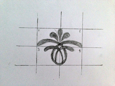
- Reflect- something beautiful, like a flower, reflecting the beauty of our world..
- Quite 'royal' inspired feeling
- Not to traditional, not to modern - best of both worlds
- Perfectly symmetrical design - Reflect!


No comments:
Post a Comment