
-----------------------
Upon looking at many newspaper designs in the 1800's you begin to truly see the potential of the column grid system. One thing I do notice, is that there is literally little if not any pictures at all used back in the 1800's, most certainly because of technological and printing methods not existing
-----------------------
On 5 May 1821 John Edward Taylor publishes the first edition of the Guardian assisted by his partner, printer, reporter and business manager, Jeremiah Garnett. The weekly newspaper ran to 4 pages and cost 7d.
In the Guardian's first decade, illustrations are restricted to line drawings, mostly appearing with advertisements. In the 1830s illustrations are discontinued due to the pressure of news and advertisements on a fixed number of pages.
The Guardian reintroduces illustrations in 1886 and drawings were used to accompany feature articles.
Walter Doughty is appointed as the Guardian's first staff photographer in July 1908, reflecting the growing importance of photography in newspapers. He records the Irish civil war (1922-23) with dramatic and moving images.
In September 1952 Guardian editor AP Wadsworth reluctantly accepts that it was time for the Guardian to place news on the front page rather than advertisements. He writes to typographer Allen Hutt, 'It's not a thing I like myself, but it seems to be accepted by all the newspaper pundits that it is preferable to be in fashion.'

The new design, launched on 29 September, also features a masthead without the definitive 'The'. One reader wrote 'The dropping of the definitive article from the title of your paper is too sudden and parochial for this part of speech is still used in other parts of the country. Why not 'T'Manchester Guardian' for a few years?'
In August 1959 readers were warned of imminent change of the name of the newspaper, 'the "Guardian" now is national in the distribution of its sales as it has long been in influence. We feel that this ought to be recognised in its name.'
The newspaper of 24 August omits 'Manchester' from its masthead. The newspaper officially changes its name to 'The Guardian', a title which had appeared over the newspaper's leading articles since 1821.
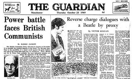
1969 saw the launch of another new masthead.
'We want to look modern, newsy,busy...' Guardian assistant editor Michael McNay briefed typographer and designer David Hillman on 12 July 1987. The new design launches on 12 February 1988 with a new masthead, new fonts and the newspaper itself split into two sections.
Readers' responses were predictably mixed. One reader from Fife wrote, 'Got the comic. Where's the newspaper?' whilst a London reader concluded, 'After four readings I can find little or nothing to beef about with your redesign. I'm stuck with liking it.'
G2 is launched as a daily tabloid section to the Guardian, 12 October 1992. Peter Preston, Guardian editor 1975-95, recalls its introduction, 'Guardian Two has suddenly another wicket to bat on. On dark news days, it could bring a lightness of touch: a different tabloid agenda set by people and issues from ordinary or extraordinary life. On momentous news days, it could add a knockout punch. Readers said they liked to read it on the way to work or in the bath when they got home. The features floor suddenly became a seething marketplace of journalists talking to each other. Creatively squared.'
The Guardian uses a colour photograph on the front page for the first time on 18 January 1995.
On 19 April 1999 the Guardian introduces design changes including clearer signposting such as the two minute Guardian and section headings for the main news pages, and a new font and smaller headline sizes:
'We're trying to take a step back by reducing the size of the headlines and making them calmer,'said the Guardian's design director, Simon Esterson: 'We want to get away from the feeling that every news page should be designed in an exciting way; rather they should be clear and well designed...We want to make intelligent pages that people want to read.'
John Sutherland later notes, 'The florid ampersand in the Comment & Analysis heading. It's designed to unsettle you, open your mind.'
12 September 2005 saw the launch of the Guardian's ground-breaking new Berliner mid-size format. The Guardian becomes the UK's first full-colour national newspaper, and the first UK national newspaper ever to adopt this size.

In January 2012 the paper's design and format undergoes another redesign to reflect changing patterns of readership and advertising. The paper reduces the number of sections it publishes to two, with the standalone sports section being integrated into the back of the main paper from Tuesdays to Fridays. G2 remains, but the Film & Music supplement is merged into the features section, completing the integration which began in September 2011 when the Media, Education and Society sections were brought into the main paper. The masthead also undergoes changes and is set against a white rather than blue background, with story trails appearing beneath it rather than above.
----------------------
I've recently began to quite like The Guardian's newspaper design.. Combining traditional and branching into new design styles, it really tries to set itself apart from other newspaper designs in the UK. I have a feeling the new design was an attempt to gain more of a younger readership while still trying to keep that traditional look for existing consumers.
'theguardian' Banner head really shows off The Guardian to try and say to be people 'Look! We can break the rules of text and drop the capital letters!' - which to me, feels like quite a bold statement.. There are many people out there who could even boycott a design because of design changes like this.
No comments:
Post a Comment